Website Design for Small Business: A Beginner-Friendly Checklist
A small business website does not need to be flashy to be effective. It needs to be clear, credible, easy to use, and built around one simple idea: help the right customer take the next step.
That sounds obvious, but in practice, many small business sites miss the mark. Owners spend money on a nice-looking homepage, then wonder why calls stay flat. Or they launch quickly with a bargain template, only to discover that the site loads slowly, buries contact information, and reads like it was written for everyone and no one at the same time.
Good web design is not decoration. It is salesmanship, customer service, and brand trust rolled into one. For a local service company, a retailer, a consultant, or a medical practice, the website often acts as the first employee a prospect meets. If it confuses people, delays them, or raises quiet doubts, business slips away before a conversation even starts.
I have seen this happen with companies that were excellent at their actual work. One contractor had glowing reviews, fair pricing, and years of experience, yet his old website looked abandoned. The phone number was hard to find, the project photos were tiny, and half the copy talked about the company instead of the homeowner’s problem. Once the site was rebuilt around clarity and trust, quote requests picked up without changing his service area or ad spend. That is the power of getting the basics right.
If you are planning a new site or trying to improve an existing one, this checklist will help you focus on what matters most.
Start with the job your website needs to do
Before colors, fonts, or page layouts, decide what success looks like. A website for a bakery has a different job than a website for a law office. One may need online ordering and daily updates. The other may need to build confidence and generate consultation requests. If you skip this step, the design tends to drift into personal taste instead of business performance.
Most small business websites need to do a handful of things well. They need to explain what the business does, who it serves, why it is trustworthy, and how to get in touch. In some cases, they also need to sell products, book appointments, or qualify leads.
That may sound basic, yet the most common weakness in website design for small business is not technical, it is strategic. Owners often know their business so well that they assume the visitor already understands the context. The site opens with vague slogans, broad claims, or industry jargon. The visitor arrives with a specific question, and the site answers a different one.
A stronger approach is to define the primary action you want from each type of visitor. A new customer may need to call, fill out a form, request a quote, or stop by the location. A returning customer may need hours, directions, or account access. A hiring candidate may need a careers page. Once you know those goals, the rest of the design becomes far easier to judge.
The beginner-friendly checklist
Use this as a practical filter while planning or reviewing your site:
- Can a first-time visitor understand what you do within five seconds?
- Is your phone number, contact form, or booking button easy to find on both desktop and mobile?
- Does the site load quickly and display cleanly on a phone?
- Does each key page build trust with real proof, such as testimonials, photos, certifications, or case examples?
- Does every page guide the visitor toward one clear next step?
If you can answer yes to all five, you are already ahead of many small business websites.
Your homepage should explain, not impress
A homepage has very little time to earn attention. Visitors do not read it like a brochure. They scan it, often while distracted, and look for quick signals that say, “Yes, you are in the right place.”
That means the opening section should lead with clarity. State what the business does, who it helps, and what action the visitor can take next. “Custom kitchen remodeling in The Woodlands” is stronger than “Building dreams with excellence.” One tells me exactly what the company offers. The other could belong to almost anyone.
This is especially important for local businesses competing in crowded markets. If someone is searching for web design the woodlands, they want to know fast whether your firm works with small businesses in that area, what kind of projects you handle, and how to get started. If they have to scroll halfway down the page to figure that out, some will leave.
Your homepage can absolutely have personality. It should feel like your brand, not a generic shell. But personality works best when it sits on top of structure. A good homepage usually opens with a clear headline, a short supporting explanation, and an obvious call to action. After that, it can reinforce trust with a brief overview of services, customer proof, location details, and a snapshot of your process or differentiators.
One practical test I use is this: cover your logo and read only the first screen. Would a stranger still understand the business? If not, the message needs work.
Design for mobile first, because that is how many people will find you
For many small businesses, more than half of website traffic comes from phones. In some local service categories, it can be much higher. That changes the design priorities.
A desktop site with a phone version is not enough. The mobile experience should be clean, fast, and thumb-friendly. Buttons need space around them. Text should be legible without pinching or zooming. Contact actions should be simple. If someone wants to call, web design Scalable Websites the phone number should be tappable. If they want directions, the map link should work instantly.
I have seen owners review a new site on a large monitor, approve it, and then later discover that the contact form is awkward on mobile, the hero image crops poorly, and the menu hides essential pages. Those details matter because mobile users are often closer to taking action. They may be comparing providers from a parking lot, a job site, or their couch after a long workday. Friction costs leads.
Speed matters too. A site does not need to be stripped of all visuals, but oversized images, too many scripts, and clunky animations can make a mobile page feel sluggish. Every extra second of waiting gives people another chance to back out.
Trust is built from specifics
Small businesses do not usually win because they have the biggest website. They win because they feel real, competent, and accountable. Strong web design supports that by showing concrete proof.
Specificity beats hype nearly every time. Instead of saying you provide “top-quality service,” show the team at work, describe your process, mention your service area, and include testimonials that sound like actual customers. If you have years in business, say so. If you are licensed, insured, certified, or locally awarded, mention it where relevant. If you have completed 150 projects or served three counties, use the number if you can stand behind it.
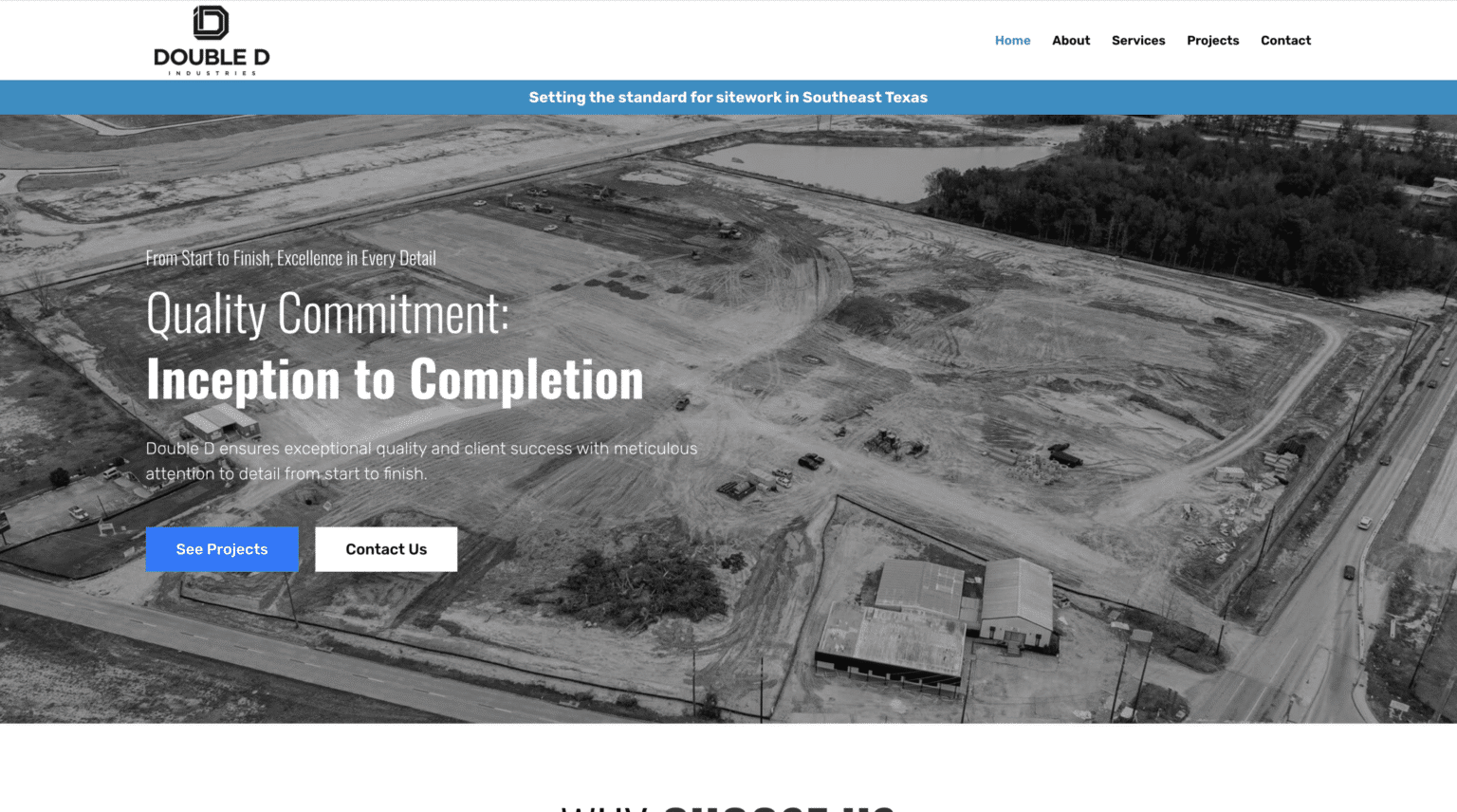

Photos are part of trust as well. Real images from your business usually outperform generic stock photos. A potential client can tell the difference, even if only subconsciously. For a contractor, before-and-after galleries matter. For a restaurant, interior shots and plated dishes matter. For a professional service firm, good portraits and a clean office environment matter.
Case studies can be powerful, even in small doses. You do not need a long white paper. A few paragraphs explaining the customer’s challenge, your approach, and the outcome can do more than a page of broad promises.
Navigation should feel effortless
People should not have to think hard about where to click. Navigation is one of those parts of web design that gets noticed mostly when it goes wrong.
Keep the main menu short and intuitive. Most small business sites do better with a modest number of top-level pages than with a sprawling menu full of overlaps. Services, about, reviews, gallery or portfolio, FAQs, and contact are common choices because they match how customers think.
The structure matters as much as the labels. If a visitor lands on an interior page from search, they should still be able to orient themselves quickly. That means consistent headers, clear page titles, obvious calls to action, and internal links that help them move naturally to the next question.
One mistake I see often is burying the contact path. A business invests in paid traffic or local SEO, then makes people hunt for the phone number or scroll through several sections before finding a form. Contact options should appear in the header, again within the body where relevant, and again near the end of key pages.
Service pages deserve more attention than most owners give them
For many small businesses, service pages are the real workhorses of the site. They often rank in search, answer buying questions, and persuade serious prospects. Yet they are frequently treated as short afterthoughts.
A strong service page does more than define the service. It speaks to the customer’s situation. It explains what problems the service solves, what the process looks like, what to expect, and why your company is a smart choice. It may include pricing guidance if appropriate, though many businesses do better with ranges or “starting at” language rather than rigid public prices.
This is one area where thoughtful web design and thoughtful writing need each other. A beautiful layout cannot save thin content. At the same time, good information buried in dense blocks of text will underperform. The page should guide the eye with meaningful headings, supporting visuals, and well-placed calls to action.
If you serve multiple locations, you may also need location-specific pages. Done well, these can be useful and conversion-friendly. Done poorly, they become repetitive filler that adds little value. Each page should reflect something real about the area, the services offered there, or the customer needs in that market.
Local businesses need local signals
A small business website should make it easy for nearby customers to confirm they are dealing with a legitimate local provider. That means your name, address, phone number, and service area need to be consistent and visible. Your contact page should not feel like a dead end. It should help people act, whether they prefer to call, email, visit, or request a quote.
Local trust signals also include maps, customer reviews from nearby clients, references to neighborhoods or communities served, and content that reflects the region naturally. If your business serves a market like The Woodlands, using terms such as web design the woodlands can make sense when it matches the page intent and the actual service area. The key is natural fit. Forced keyword stuffing makes pages weaker, not stronger.
Google Business Profile and your website should also support each other. If your site says one thing and your local listings say another, people notice. So do search engines. Consistency is not glamorous, but it is part of credibility.
Content should sound like a real business, not a template
Visitors can tell when copy is generic. It often leans on empty phrases, says little of substance, and sounds like it could belong to five competitors at once. That kind of writing does not merely fail to persuade, it creates doubt.
Better website copy sounds like someone who understands the customer’s problem and knows how to solve it. It uses plain language where possible. It avoids overexplaining what the business already knows and focuses on what the customer needs to decide.
A simple shift helps: write to the customer’s questions. What do they worry about before hiring you? What misconceptions do they have? What do they need to know about timing, cost, scope, or process? If you answer those questions clearly, your site becomes more useful and more persuasive.
This is where experienced web design teams often stand apart. They do not just arrange boxes on a page. They help shape the message so the design can do its job.
The technology stack matters, but not in the way most beginners think
Small business owners often get pulled into platform debates early. WordPress or Shopify. Custom build or page builder. One host versus another. Those choices do matter, but they matter less than fit, maintainability, and execution.
The right platform is the one your business can actually manage, update, and scale without constant frustration. For a content-rich service site, WordPress may be a practical choice. For ecommerce, Shopify may save time and headaches. A custom build can be excellent for the right project, but it can also create dependence if only one developer can maintain it.
Ask practical questions. Who will update hours, team pages, blog posts, or photos? How easy is it to add landing pages later? Can the site support forms, scheduling, ecommerce, analytics, and SEO basics without fragile workarounds? Is security handled properly? Are backups in place?
These are not glamorous questions, but they are the ones that affect your site six months after launch.
Cheap web design can get expensive fast
Every small business has a budget. That is reality. But there is a difference between spending carefully and buying the wrong thing.
The cheapest website options often save money only at the beginning. A low-cost build may rely on bloated templates, weak copy, poor mobile performance, or little strategic thought. Then the owner pays again to fix the problems, rebuild pages, or recover lost opportunities. I have seen businesses spend a few thousand dollars twice when spending a bit more once would have produced a stronger result.
This does not mean every business needs a large custom budget. Many do very well with a modest, focused site. The question is whether the design serves the business goal. A five-page site with excellent messaging, strong mobile usability, and clear calls to action will often outperform a sprawling fifteen-page site that looks polished but says very little.
If you are comparing providers, pay attention to what is included. Some firms offer web design but leave copywriting, SEO structure, image sourcing, analytics setup, and revisions mostly on the client. Others guide the entire process. That difference affects results more than many owners realize.
Watch for these red flags before you launch
A site can look nearly finished and still have serious weaknesses. Before launch, step back and look for common trouble spots:
- The homepage headline is clever but unclear.
- Key pages have no real proof, only claims.
- Forms ask for too much information too soon.
- The mobile version feels cramped or slow.
- There is no obvious next step on service pages.
Those issues do not require a full rebuild in most cases, but they should be fixed before traffic starts flowing.
A website should keep working after launch
Launch day is not the finish line. It is the start of the part that actually matters, how the site performs with real visitors.
Once the site is live, pay attention to what people do. Which pages attract traffic? Where do leads come from? Which forms get completed? Which pages have high drop-off rates? Even basic analytics can reveal useful patterns. Sometimes a page that seemed secondary becomes a top entry point. Sometimes a call to action that looked strong during design gets ignored in real use.
Plan to update the site as the business evolves. Add new testimonials. Refresh photos. Improve service pages. Expand FAQs based on real customer conversations. Tighten copy where people seem confused. Good websites are not static brochures. They are working tools.
This matters even more in competitive local markets. If several businesses offer similar services, the one that continually sharpens its message and usability often gains ground over time. That is true whether you are selling legal services, home renovation, wellness care, or web design.
The real standard is simple
The best small business websites are not necessarily the most complex. They are the ones that make a potential customer feel oriented, reassured, and ready to act.
If your site clearly says what you do, proves you can do it, and makes it easy to contact you, you are far ahead of the businesses still hiding behind vague slogans and cluttered layouts. That is the standard to aim for.
For owners who feel overwhelmed by the process, this should be encouraging. You do not need every trend. You do not need fancy effects. You need disciplined, thoughtful website design for small business, built around the people you serve and the action you want them to take.
That is what good web design has always been about. Not showing off, but making the decision easier for the customer standing on the other side of the screen.
Scalable Websites
Website design for contractors and small businesses
Based in Montgomery, TX, serving Montgomery County and greater Houston
Phone: (832) 979-2478
Website: scalablewebsites.com
Hours: Monday to Friday, 8 AM to 5 PM
Scalable Websites builds and manages mobile-first websites for contractors and small businesses on simple monthly plans, with hosting, security and unlimited updates included. Find us on Google.